

Look beneath the surface and you’ll see all that CMC offers — Strength. Integrity. Dependability.
That’s not just a description of our products, but also our people. Sure, you’ll find CMC construction solutions at the heart of much of our modern infrastructure — from AT&T Stadium in Dallas to the Pentagon to essential highways, bridges and buildings all over the world.
But at CMC, we also work hard to build something far more important — lasting relationships.
The kind of partnerships that keep our customers returning to us time and again for their most important and challenging projects. Such loyalty doesn’t happen by chance or convenience. It’s the result of the passion of our people. At CMC, we care about the products we make, the folks we make them for, and the world we all share — now and for generations to come.
what we do
Forward Thinking
.svg?ext=.svg) T-Post Automation
T-Post Automation
T-Post Automation
CMC currently operates the most automated T-post fabrication facility in the world.
Learn More Net Zero Steel
Net Zero Steel
In 2022, CMC launched its Zero line, providing customers with a carbon-neutral steel solution.
Learn More Mini Mill
Mini Mill
Every CMC mill uses electric energy and 100% recycled scrap to produce our products.
Learn More Slitting Process
Slitting Process
CMC was the first in the industry to successfully complete a three and five slit process.
Learn More Micro Mill
Micro Mill
CMC was the first in the world to successfully operate a highly energy-efficient micro mill.
Learn More my CMC
my CMC
CMC was the first steel company in the U.S. to build and release an online customer portal.
Learn More Trucking Fleet
Trucking Fleet
CMC has its own trucking fleet dedicated to meeting our customers’ needs.
Learn More Spooled Rebar
Spooled Rebar
CMC became the first producer of spooled rebar in the U.S.
Learn More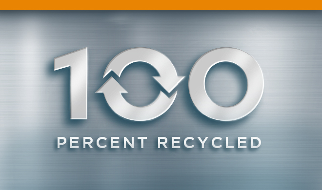
WE USE 100% RECYCLED STEEL
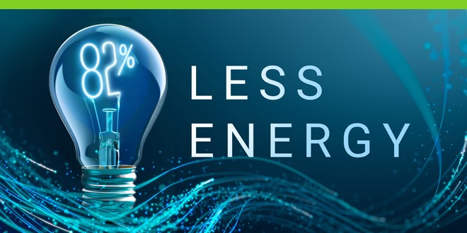
We use 82% less energy than traditional steelmaking

We produce 64% less CO2 per ton of steel
x-ray vision
see what's inside
CMC steel serves as the backbone for an incredible array of highways, structures and other projects. It’s just not always obvious. That’s why we’ve created this easy way for you to look inside and see the strength and versatility of CMC steel for yourself.


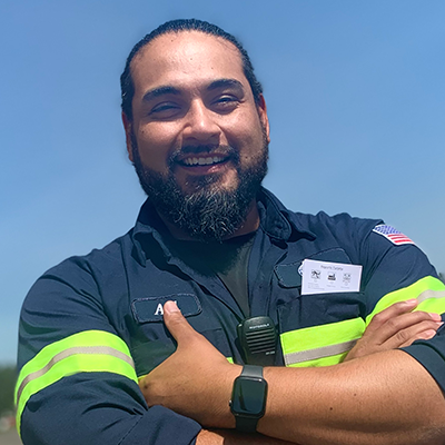
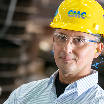
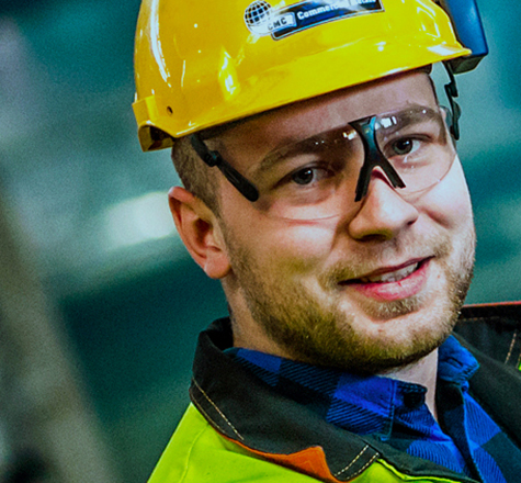
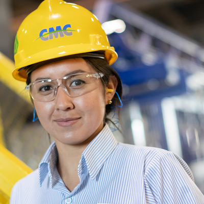
Profiles in Steel
AJ R.
- Plant Manager
- CMC Recycling
- 14 Years at CMC
Making it Happen

Laura L.
- Office Manager
- CMC Recycling
- 14 Years at CMC
Making it Happen
Eloy C.
- Production & Safety Supervisor
- Rebar Fabrication
- 25 Years at CMC
Making it Happen
Patryk P.
- Electrician
- Mill Operations
- 2 Years at CMC
Making it Happen
Nathaly R.
- Estimator
- Rebar Fabrication
- 3.5 Years at CMC
Making it Happen
scrap can be beautiful

Lucas Sanchez
Grade 101939


John Sanchez
Grade 12John Sanchez


Laurel Rutherford
Grade 12Face Your Fears


Quinn Espinoza
Grade 12Trumpet Flower


Quinn Espinoza
Grade 12Anomalocaris

Julian Padilla
Grade 11Honey Bee


Lucas Sanchez
Grade 10Banju

John Sanchez
Grade 12Diamond

Lucas Sanchez
Grade 10Gar

Laurel Rutherford
Grade 12Rat Dragon